
Sometimes a logo tells the story of a product’s unique characteristics and approach even more than the product itself. As part of its brand update, MOMOTARO JEANS entrusted designer Ikki Kobayashi with finding a new way to express this important symbol. How did Kobayashi use his signature monochrome and bold style to express our identity, with our roots in Kojima, Okayama and dedication to artisanship? What thoughts were incorporated in the logo, and what design possibilities did he uncover?
PHOTO : Local Artist EDIT & TEXT : Rui Konno
Kobayashi’s reason for accepting the offer


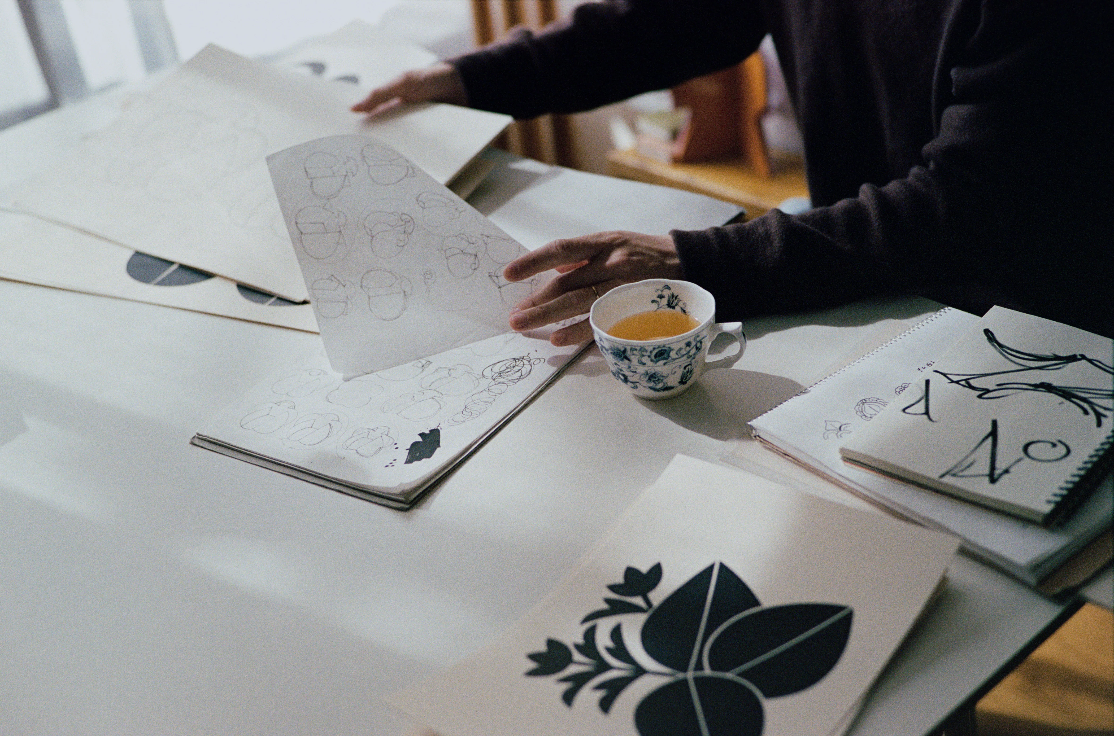
―You have brought a lot of materials and sketches with you. Is this the MOMOTARO JEANS zodiac series?
Kobayashi: Yes. The snake design was released this year, but I have designs for all 12 years of the Chinese zodiac. Tastes can change over 12 years, but by designing everything in advance, I thought I could maintain a consistent tone and manner.
―There are probably not many projects where the offer asks you to design something 12 years ahead, even among long-term projects.
Kobayashi: You are right. I agreed to it easily, but it turned out to be quite challenging. When I draw, I feel like I could refine things a bit more, so I end up creating three or four versions. But when you multiply that by 12 years, one proposal alone ends up with about 40 designs. But I still enjoy it.
―You readily accepted the request from MOMOTARO JEANS for designs. Could you tell us about your reason for doing so?
Kobayashi: I received a very passionate email at the time of the rebranding. It seemed that they were assembling really great team members, which made me want to join them. The initial request came from SIMONE (the agency handling the creative direction of MOMOTARO JEANS). Back when I worked at Shiseido, SIMONE would often work with us. But at the time, I was truly a newcomer. I ultimately left the company after four years before even becoming an art director. So I did not think they remembered me, but it turns out they had been paying attention.

― So that’s the story.
Kobayashi: It was also a time when my daughter was around two or three years old, so I was not in a position to take on much work. But SIMONE handled simulations for how the product tags would be designed.
―How did the actual logo design process unfold?
Kobayashi: The original MOMOTARO JEANS logo was a literal depiction of Momotaro (“Peach Boy,” a Japanese folklore hero associated with Okayama), in both a figurative and illustrative sense. We discussed firstly moving away. We explored whether there were alternative approaches while keeping the core idea of Momotaro emerging from a peach with jeans on, or if it was possible to represent not Momotaro himself but rather a peach or an abstract icon-like symbol. It was suggested that we consider those two core concepts. In terms of the aesthetic, Kurashiki is an area with an active folk craft tradition, that was initially one of the references. But I also felt that leaning too much in that direction might not be ideal.
―Why did you feel that way?
Kobayashi: Jeans are industrial products, not folk crafts. Even if the product story is rooted in Okayama’s regional character, it does not mean the logo must adopt a folk craft-style symbol. I thought it might end up looking merely “folk craft-inspired.”

―In the end, the final logo became highly abstract and contemporary.
Kobayashi: Yes. The expectation for me was to shift away from an illustrative logo, and I also sensed an anticipation for an abstract aesthetic. I also considered making it more like a Japanese-style family crest. I think the smallest place where the logo appears is on the rivets. At such a small scale, fine details cannot be rendered clearly, so minimizing the number of vector paths was a prerequisite. Naturally, abstraction means stripping away details, which can make things harder to recognize, so the fine-tuning was difficult.
Reconsidering the story of Momotaro

―There seems to be quite a difference between designing an entirely new brand logo from scratch and revamping a logo for a long-established brand like this one.
Kobayashi: MOMOTARO JEANS has a core fan base, and understanding their feelings made the process even more challenging. I love soccer, and I have felt a bit let down when a team I support changed its logo. So I completely understand their feelings. That is why I thought carefully about what I could do in this situation.
―During that process, you even experimented with designs that completely omitted Momotaro, right?
Kobayashi: Yes. We removed Momotaro at one point, but then we realized, “He’s definitely necessary.” Because Momotaro is a folktale often told to children, I wondered about restructuring the logo into a more minimalistic and organized form, like building blocks. Origami might be another possible form. As I kept exploring those connections, I started wondering, “What’s up with Momotaro being born in a peach?”
―Now that you mention it, it is a rather fantastical story.
Kobayashi: It really is. But I felt that kind of imagination was actually quite important. Since the old woman who found Momotaro in the peach was washing clothes, it was probably at a small river. Would I pick up a peach if it came floating down a river? A peach big enough to contain a child would probably be around 120 cm, right? If she did pick it up and take it home, she might have waited for her husband to return from cutting grass to ask him what to do, given the patriarchal society at the time. And if the old man had just finished cutting grass, instead of feeling exhausted after working, he would probably be running on adrenaline. So maybe that is why he went ahead and cut open the peach without calling the townspeople or police?
―Everyone knows this story, but I doubt many people have analyzed it in such detail.
Kobayashi: And considering that he emerged from a peach, Momotaro clearly is not human. He is something special, maybe even a kind of supernatural being. So I felt the need to depict that supernatural aspect. but I thought if I actually suggested that, people would think I was weird, so I kept it to myself.
―Imagining that kind of discussion is pretty surreal. The outline of the design looks like a flower, doesn’t it?
Kobayashi: Yes, it is an indigo flower. I often create traditional Japanese-style family crests and patterns as personal projects, and when I do, I try to follow classical styles as closely as possible. I have a book from the Meiji period (1868–1912) here that compiles various crests, including ones with peach motifs. Peach crests have also been associated with warding off evil. I thought it was important to connect each of these contexts while ensuring that the design was not driven by my own ego.
―Looking at the rough sketches, it seems you start your design process with hand-drawing.
Kobayashi: Yes, I basically always do hand-drawing. Actually, many of my clients request that I leave in the slight inconsistencies and blurriness in the final work that I submit.
―When did you develop your current artistic style?
Kobayashi: Back when I was at Shiseido. Many people may know this, but at Shiseido, there is a year-long training where you actually learn to hand-letter the Shiseido typeface. Some people take to it, and some do not, but I found the craftsmanship aspect really suited me. Through the act of writing, I felt like I was internalizing Shiseido’s unique aesthetic. I also thought it would be a waste if that sensibility was limited only to typography. I started wondering if I could apply that idea of learning unique aesthetics through drawing in other fields. It led me to reinterpret and create my own versions of traditional family crests.
Sports and uniforms


ーThis approach is connected to your current creative work, isn’t it?
Kobayashi: I originally did it to internalize the aesthetics of family crests, but as I kept going, I started wondering things like, “What about graffiti?” As I absorbed the elements of completely different genres one by one, I gradually became capable of responding to a variety of client projects. I have always loved drawing by hand, which is why I set my sights on the art world and attended an art university. I want to stay true to my pure passion at the very beginning. My sharply defined monochrome style mostly took shape after I joined Shiseido. These days, I primarily use three thicknesses of Posca markers and a 0.05 mm Pigma pen on ivory Kent paper.
―Was drawing your formative experience with the appeal of design?
Kobayashi: No. I mentioned soccer earlier, but I have always thought that sports uniforms look really cool. I attended a school that was strong in sports, so being around soccer and baseball made me want a job related to sports. I started thinking about how I could get involved, and I decided to attend an art university.
―That was quite an unexpected path!?
Kobayashi: Yes. Around when I was in my third year of high school, I happened to visit an exhibition at the ginza graphic gallery featuring the work of Max Huber, a designer based in Italy. He was active since before World War II and created graphics for motorsports, racing, and skiing. Seeing his work made me feel inspired as I realized, “So sports graphics can be this minimalistic.” I thought being a graphic designer seemed fascinating, and if I ever had the chance to design uniforms, skills in pattern design and flat-surfaces would be useful. Back then, if you went to a soccer stadium, there would be scalpers selling cheap knockoff uniforms, and I enjoyed looking at those.

―By the way, which team’s uniform is your favorite?
Kobayashi: I like high school soccer uniforms. Last year, Tokai University Sagami Senior High School made it to the national tournament for the first time in a while, and I thought their yellow-and-black “tiger color” uniform was incredibly cool. Maebashi Ikuei High School’s uniforms are good too, but Sagami’s yellow and black uniforms are particularly great. I think the reason I like them is that unlike professional soccer uniforms, which are covered with sponsor logos and other information unrelated to sports, high school sports uniforms are free of that. High school uniforms also incorporate kanji for the school name, creating a strong local feel. Even compared to soccer culture worldwide, Japanese school uniforms seem unique. That said, in professional soccer, I think it is really cool when the team uniform has a sponsor logo fits perfectly, such as Juventus with Jeep. On a related note, although this is unrelated to sports, I have always seen jeans as a kind of uniform. That is a point of interest. However, incorporating that idea into logo design was difficult.
―That makes sense. Denim is something different from just a fashion item.
Kobayashi: Jeans feel more like a type of apparel tied to a sense of camaraderie or team identity. That is why I think it would be interesting to create something that fits perfectly for people who resonate with that.
Before Words Take Shape
―Before meeting you, I looked through Before Words Take Shape, which you published last year. The title left a strong impression on me, so to be honest, I was a little surprised that you have explained your perspective and logic so thoroughly like this.
Kobayashi: There is not a single letter inside the book.
―Yes. It simply presents monochrome, bold works one after another, without any explanations or titles, which I think is incredibly austere.
Kobayashi: At the time I was making that book, my daughter was around two years old, and we often picked up stones together. My daughter would pick up stones she found interesting and show them to me, but to me, they were just pieces of concrete. What we consider “good stones” are usually round ones or those with beautiful patterns, right? We have been educated and conditioned to think that way.
―That is true. It is like a fixed notion.
Kobayashi: That’s right. But a two-year-old, who has hardly received any education, selects objects with a more instinctive, personal sensitivity—unlike us, whose perspectives have been “corrected” over time. That really caught my attention.

―Such young children are still in a completely unbiased state.
Kobayashi: Exactly. I wondered if I could adopt that way of seeing things again. So I began sketching objects that caught my eye while walking, just like how a child picks up stones. Before recognizing what something was, I would sketch it. When I had accumulated 50, then 100 of these sketches, I turned them into postcards all at once. The key was to draw everything I saw, without judging whether it was good or bad. I wanted to see what patterns or preferences would emerge once I gathered all the drawings with my perceptions. That is why my book’s title refers to things recorded before words emerge.
―It was also a time before your daughter had developed language skills.
Kobayashi: Yes. I felt as if I had been relying too much on shapes and other things I liked in my work, but spending time with my child often challenged those preferences. I realized I needed to break that down, and that is why I created those works. I compiled the book in the hope that others might experience a similar perspective shift through experiencing the book. That is why I chose not to include any text, introduction, or afterword that might influence one’s perspective. I wanted people to open the book and think, “What is this?” An ideal scenario would be if someone eventually sells the book, and then it is discovered in a secondhand bookstore overseas, leaving someone else wondering, “What is this?”
―That is a very interesting vision. But I doubt anyone who picks up your book would grasp its intent.
Kobayashi: I wanted to create something like a mysterious box, such as a basket full of stones collected by a child, or the toy car I had when I was little that I would fill with acorns. To dilute the individual memories, I needed volume. But after making about 600 drawings, I was surprised to discover that I could not forget them. Right now, I have around 3,000 sketches in a different format in sketchbooks, and I think at that scale, I might finally be able to forget them.
―But the fact that you even consider how your work will be received and interpreted afterward feels very characteristic of you.
Kobayashi: For my designs as well, I work quite steadily and methodically, but the moment when my finished design is put to use is when I feel the greatest sense of accomplishment. When I see people happily using what I created, that is what I think. I especially enjoy hearing them have fantasies like, “Someday, I would like to do something like this,” or “Later, I want to do something like this.” When what I provide helps steer their lives in a slightly more interesting direction, that makes me happy.

Ikki Kobayashi
Kobayashi was born in 1992 in Shiga Prefecture. After graduating from Tama Art University, he joined Shiseido’s creative headquarters before going independent in 2019. He has received accolades such as the Tokyo TDC Award and the JAGDA New Designer Award. Recently, he achieved a long-held dream of designing uniforms for a global sports event. He continues to work at his own personal yet energetic pace.
